制作 组件
[toc]
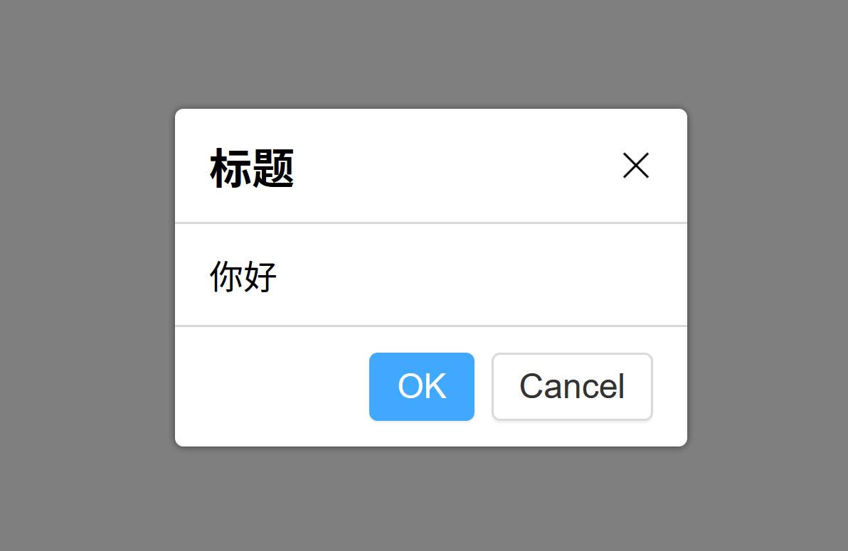
Dialog需求分析与API设计
- 借鉴 AntD/ Bulma/Eleme/iView/Vuetify 等
- 需求
- 点击后弹出
- 有遮罩层
- 有close按钮x
- 有标题
- 有内容
- 有 OK/Cancel 按钮
API
1
2
3
4
5
|
<Dialog :visible="true"
        title="标题"
        @yes="fn1"
        @no="fn2"
></Dialog>
|
创建Dialog组件
Dialog.vue
 1
 2
 3
 4
 5
 6
 7
 8
 9
10
11
12
13
14
15
16
17
18
19
20
21
22
23
24
|
<script setup lang="ts">
import Button from '@/lib/Button.vue';
</script>

<template>
  <div class="vue-dialog-overlay"></div>
  <div class="vue-dialog-wrapper">
    <header>Title</header>
    <main>
      <p>some content...</p>
      <p>some content...</p>
    </main>
    <footer>
      <Button>OK</Button>
      <Button>Cancel</Button>
    </footer>
  </div>
</template>

<script lang="ts">
export default {
  name: 'Dialog'
};
</script>
|
DialogDemo.vue
 1
 2
 3
 4
 5
 6
 7
 8
 9
10
11
12
13
14
15
|
<script setup lang="ts">
import Dialog from '@/lib/Dialog.vue';
</script>

<template>
  <h1>Dialog 示例</h1>
  <h2>示例一</h2>
  <Dialog></Dialog>
</template>

<script lang="ts">
export default {
  name: 'DialogDemo'
};
</script>
|
Dialog.vue添加基本样式
让Dialog支持visible属性
勿用动词show表示是否可见 Dialog.vue
  1
  2
  3
  4
  5
  6
  7
  8
  9
 10
 11
 12
 13
 14
 15
 16
 17
 18
 19
 20
 21
 22
 23
 24
 25
 26
 27
 28
 29
 30
 31
 32
 33
 34
 35
 36
 37
 38
 39
 40
 41
 42
 43
 44
 45
 46
 47
 48
 49
 50
 51
 52
 53
 54
 55
 56
 57
 58
 59
 60
 61
 62
 63
 64
 65
 66
 67
 68
 69
 70
 71
 72
 73
 74
 75
 76
 77
 78
 79
 80
 81
 82
 83
 84
 85
 86
 87
 88
 89
 90
 91
 92
 93
 94
 95
 96
 97
 98
 99
100
101
102
103
104
105
106
107
108
109
110
111
112
113
114
115
116
|
<template>
<template v-show="visible">
<div class="vue-dialog-overlay"></div>
<div class="vue-dialog-wrapper">
<div class="vue-dialog">
<header>Title <span class="vue-dialog-close"></span></header>
<main>
<p>some content...</p>
<p>some content...</p>
</main>
<footer>
<Button level="main">OK</Button>
<Button>Cancel</Button>
</footer>
</div>
</div>
</template>
</template>
<script setup lang="ts">
import Button from '@/lib/Button.vue';
import {onUpdated, toRefs} from 'vue';
const props = defineProps({
visible: Boolean
});
// destructured prop visible is Value (integer for e.g.) which cannot be reactive by itself
// 解构出来的visible为简单类型,不再具有数据响应性
// 需要调用 toRefs(props) 赋予数据响应性
const {visible} = toRefs(props);
onUpdated(() => {
console.log('visible: ', visible.value);
});
</script>
<style lang="scss" scoped>
@import 'var.scss';
.vue-dialog {
background: white;
border-radius: $radius;
box-shadow: 0 0 3px fade_out(black, 0.5);
min-width: 15em;
max-width: 90%;
// 邻层的遮罩层
&-overlay {
position: fixed;
top: 0;
left: 0;
width: 100%;
height: 100%;
background: fade_out(black, 0.5);
z-index: 10;
}
// 外层样式
&-wrapper {
position: fixed;
left: 50%;
top: 50%;
transform: translate(-50%, -50%);
z-index: 11;
}
> header {
padding: 12px 16px;
border-bottom: 1px solid $border-color;
display: flex;
align-items: center;
justify-content: space-between;
font-size: 20px;
}
> main {
padding: 12px 16px;
}
> footer {
border-top: 1px solid $border-color;
padding: 12px 16px;
text-align: right;
}
// 关闭的叉字
&-close {
position: relative;
display: inline-block;
width: 16px;
height: 16px;
cursor: pointer;
&::before,
&::after {
content: '';
position: absolute;
height: 1px;
background: black;
width: 100%;
top: 50%;
left: 50%;
}
&::before {
transform: translate(-50%, -50%) rotate(-45deg);
}
&::after {
transform: translate(-50%, -50%) rotate(45deg);
}
}
}
</style>
|
DialogDemo.vue
1
2
3
4
5
6
7
8
9
10
11
12
13
14
15
16
17
18
19
20
21
22
23
24
25
26
|
<script setup lang="ts">
import {ref} from 'vue';
import Button from '@/lib/Button.vue';
import Dialog from '@/lib/Dialog.vue';
const x = ref(false);
const toggle = () => {
x.value = !x.value;
console.log(x.value);
};
</script>
<template>
<h1>Dialog 示例</h1>
<h2>示例一</h2>
<Button @click="toggle">toggle</Button>
<Dialog :visible="x"></Dialog>
{{ x }}
</template>
<script lang="ts">
export default {
name: 'DialogDemo'
};
</script>
|
解构props后,会使得数据失去响应,必须使用roRefs()重新赋予数据响应性
使用<template v-show="visible">不显示
- 在 元素上使用 v-if 条件渲染分组
- 使用
<template v-if="visible">代替
- 带有
v-show 的元素始终会被渲染并保留在 DOM 中
v-show 只是简单地切换元素的 CSS property displayv-show 不支持 <template> 元素,也不支持v-else
v-if vs v-show
- v-if 是“真正”的条件渲染,在切换过程中,条件块内的事件监听器和子组件适当地被销毁和重建
- v-if 是惰性的:如果在初始渲染时条件为假,则什么也不做——直到条件第一次变为真时,才会开始渲染条件块
v-show 中元素总是会被渲染,并且只是简单地基于 CSS 进行切换v-if 有更高的切换开销,而 v-show 有更高的初始渲染开销v-show 不支持 <template> 元素,也不支持v-else
- 如果需要非常频繁地切换,则使用 v-show 较好;如果在运行时条件很少改变,则使用 v-if 较好
让Dialog支持点击关闭
Dialog.vue有四处需要设置监听关闭的逻辑
- 关闭图标x
- 黑色遮罩层
- OK按钮
- Cancel按钮
设置关闭图标x的关闭逻辑
  1
  2
  3
  4
  5
  6
  7
  8
  9
 10
 11
 12
 13
 14
 15
 16
 17
 18
 19
 20
 21
 22
 23
 24
 25
 26
 27
 28
 29
 30
 31
 32
 33
 34
 35
 36
 37
 38
 39
 40
 41
 42
 43
 44
 45
 46
 47
 48
 49
 50
 51
 52
 53
 54
 55
 56
 57
 58
 59
 60
 61
 62
 63
 64
 65
 66
 67
 68
 69
 70
 71
 72
 73
 74
 75
 76
 77
 78
 79
 80
 81
 82
 83
 84
 85
 86
 87
 88
 89
 90
 91
 92
 93
 94
 95
 96
 97
 98
 99
100
101
102
103
104
105
106
107
108
109
110
111
112
113
114
115
116
117
118
119
120
121
122
123
124
125
126
|
<script setup lang="ts">
import Button from '@/lib/Button.vue';
import {toRefs} from 'vue';
interface Props {
visible?: boolean;
}
const props = withDefaults(defineProps<Props>(), {
visible: false
});
// destructured prop visible is Value (integer for e.g.) which cannot be reactive by itself
// 解构出来的visible为简单类型,不再具有数据响应性
// 需要调用 toRefs(props) 赋予数据响应性
// 或者直接使用 props.visible
const {visible} = toRefs(props);
// 关闭对话框逻辑
const emits = defineEmits(['update:visible']);
const close = () => {
emits('update:visible', false);
};
</script>
<template>
<template v-if="visible">
<div class="vue-dialog-overlay" @click="close"></div>
<div class="vue-dialog-wrapper">
<div class="vue-dialog">
<header>Title
<span class="vue-dialog-close"
@click="close"></span>
</header>
<main>
<p>some content...</p>
<p>some content...</p>
</main>
<footer>
<Button level="main">OK</Button>
<Button>Cancel</Button>
</footer>
</div>
</div>
</template>
</template>
<style lang="scss" scoped>
@import 'var.scss';
.vue-dialog {
background: white;
border-radius: $radius;
box-shadow: 0 0 3px fade_out(black, 0.5);
min-width: 15em;
max-width: 90%;
// 邻层的遮罩层
&-overlay {
position: fixed;
top: 0;
left: 0;
width: 100%;
height: 100%;
background: fade_out(black, 0.5);
z-index: 10;
}
// 外层样式
&-wrapper {
position: fixed;
left: 50%;
top: 50%;
transform: translate(-50%, -50%);
z-index: 11;
}
> header {
padding: 12px 16px;
border-bottom: 1px solid $border-color;
display: flex;
align-items: center;
justify-content: space-between;
font-size: 20px;
}
> main {
padding: 12px 16px;
}
> footer {
border-top: 1px solid $border-color;
padding: 12px 16px;
text-align: right;
}
// 关闭的叉字
&-close {
position: relative;
display: inline-block;
width: 16px;
height: 16px;
cursor: pointer;
&::before,
&::after {
content: '';
position: absolute;
height: 1px;
background: black;
width: 100%;
top: 50%;
left: 50%;
}
&::before {
transform: translate(-50%, -50%) rotate(-45deg);
}
&::after {
transform: translate(-50%, -50%) rotate(45deg);
}
}
}
</style>
|
DialogDemo.vue
1
2
3
4
5
6
7
8
9
10
11
12
13
14
15
16
17
18
19
20
21
22
23
|
<script setup lang="ts">
import {ref} from 'vue';
import Button from '@/lib/Button.vue';
import Dialog from '@/lib/Dialog.vue';
const x = ref(false);
const toggle = () => {
x.value = !x.value;
};
</script>
<template>
<h1>Dialog 示例</h1>
<h2>示例一</h2>
<Button @click="toggle">toggle</Button>
<Dialog v-model:visible="x"></Dialog>
</template>
<script lang="ts">
export default {
name: 'DialogDemo'
};
</script>
|
注意不能在子组件中直接修改props
- 使用
const emits = defineEmits(['update:visible']);发布到外层组件
- 外层组件中监听自定义事件
<Dialog :visible="x" @update:visible="x = $event"></Dialog>
- 可以使用
v-moddel语法糖简写<Dialog v-model:visible="x"></Dialog>
设置点击遮罩层,可选的执行关闭逻辑,默认为执行关闭
对不同的<Dialog>的需要设置不同的visible
设置OK和Cancel按钮的关闭逻辑
 1
 2
 3
 4
 5
 6
 7
 8
 9
10
11
12
13
14
15
16
17
18
19
20
21
22
23
24
25
26
27
28
29
30
31
32
33
34
35
36
37
38
39
40
41
42
43
44
45
46
47
48
49
50
51
52
53
54
55
56
57
58
59
60
61
62
63
|
<script setup lang="ts">
import Button from '@/lib/Button.vue';
import {toRefs} from 'vue';
// 注册外部带默认值的数据
interface Props {
visible?: boolean;
closeOnClickOverlay?: boolean;
}
const props = withDefaults(defineProps<Props>(), {
visible: false,
closeOnClickOverlay: true
});
const {visible, closeOnClickOverlay} = toRefs(props);
// 注册发布自定义事件
const emits = defineEmits(['update:visible', 'ok', 'cancel']);
// 关闭对话框逻辑
const close = () => {
emits('update:visible', false);
};
// 遮罩层关闭逻辑
const onClickOverlay = () => {
if (closeOnClickOverlay.value) {
close();
}
};
// OK Cancel按钮关闭逻辑
const ok = () => {
emits('ok', false);
};
const cancel = () => {
emits('cancel', false);
};
</script>
<template>
<template v-if="visible">
<div class="vue-dialog-overlay" @click="onClickOverlay"></div>
<div class="vue-dialog-wrapper">
<div class="vue-dialog">
<header>Title
<span class="vue-dialog-close"
@click="close"></span>
</header>
<main>
<p>some content...</p>
<p>some content...</p>
</main>
<footer>
<Button level="main" @click="okFn">OK</Button>
<Button @click="cancelFn">Cancel</Button>
</footer>
</div>
</div>
</template>
</template>
...
|
需要考虑到,当用户在对话框中填空时,需要额外的逻辑判断是否按照要求填空
- 当用户在对话框中填空未完成时,不可直接关闭对话框
emits('xxx', false); 发布事件的操作时没有返回值的,永远是undefined- 在初始化
Dialog组件时就需要用户传递ok与cancel的回调函数
DialogDemo.vue
 1
 2
 3
 4
 5
 6
 7
 8
 9
10
11
12
13
14
15
16
17
18
19
20
21
22
23
24
25
26
27
28
29
30
31
32
33
|
<script setup lang="ts">
import {ref} from 'vue';
import Button from '@/lib/Button.vue';
import Dialog from '@/lib/Dialog.vue';
const x = ref(false);
const toggle = () => {
x.value = !x.value;
};
// 指定ok cancel的回调
const fn1 = () => {
console.log(1);
};
const fn2 = () => {
console.log(2);
};
</script>
<template>
<h1>Dialog 示例</h1>
<h2>示例一</h2>
<Button @click="toggle">toggle</Button>
<Dialog v-model:visible="x" :closeOnClickOverlay="true"></Dialog>
<h2>示例二 点击遮罩层不执行关闭逻辑</h2>
<Button @click="toggle">toggle</Button>
<Dialog v-model:visible="x" :closeOnClickOverlay="false"></Dialog>
<h2>示例三 点击ok cancel 预定义回调</h2>
<Button @click="toggle">toggle</Button>
<Dialog v-model:visible="x"
:ok="fn1" :cancek="fn2"></Dialog>
</template>
|
Dialog.vue
1
2
3
4
5
6
7
8
9
10
11
12
13
14
15
16
17
18
19
20
21
22
23
24
25
26
27
28
29
30
31
32
33
34
35
36
37
38
39
40
41
42
43
44
45
46
47
48
49
50
51
|
<script setup lang="ts">
import Button from '@/lib/Button.vue';
import {toRefs} from 'vue';
// 注册外部带默认值的数据
interface Props {
visible?: boolean;
closeOnClickOverlay?: boolean;
ok?: Function;
cancel?: Function;
}
const props = withDefaults(defineProps<Props>(), {
visible: false,
closeOnClickOverlay: true
});
// destructured prop visible is Value (integer for e.g.) which cannot be reactive by itself
// 解构出来的visible为简单类型,不再具有数据响应性
// 需要调用 toRefs(props) 赋予数据响应性
// 或者直接使用 props.visible
const {visible, closeOnClickOverlay} = toRefs(props);
// 注册发布自定义事件
const emits = defineEmits(['update:visible']);
// 关闭对话框逻辑
const close = () => {
emits('update:visible', false);
};
// 遮罩层关闭逻辑
const onClickOverlay = () => {
if (closeOnClickOverlay.value) {
close();
}
};
// OK Cancel按钮关闭逻辑
const okFn = () => {
if (props.ok && props.ok() !== false) {
close();
}
};
const cancelFn = () => {
if (props.cancel && props.cancel() !== false) {
close();
}
};
</script>
...
|
让Dialog支持自定义内容:title和content
使用插槽实现用户自定义title和content
DialogDemo.vue
1
2
3
4
5
6
7
8
9
10
11
12
13
14
15
16
17
18
19
20
21
22
23
24
25
26
27
28
29
30
31
32
33
|
<script setup lang="ts">
import ...;
const x = ref(false);
const toggle = () => {
x.value = !x.value;
};
// 指定ok cancel的回调
const fn1 = () => {
return false;
};
const fn2 = () => {
};
</script>
<template>
<h1>Dialog 示例</h1>
<h2>示例一</h2>
<Button @click="toggle">toggle</Button>
<Dialog v-model:visible="x" :closeOnClickOverlay="true"></Dialog>
<h2>示例二 点击遮罩层不执行关闭逻辑</h2>
<Button @click="toggle">toggle</Button>
<Dialog v-model:visible="x" :closeOnClickOverlay="false"></Dialog>
<h2>示例三 点击ok cancel 预定义回调</h2>
<Button @click="toggle">toggle</Button>
<Dialog v-model:visible="x"
:ok="fn1" :cancel="fn2">
<div>自定义内容</div>
<div>自定义内容</div>
</Dialog>
</template>
|
Dialog.vue
 1
 2
 3
 4
 5
 6
 7
 8
 9
10
11
12
13
14
15
16
17
18
19
20
21
22
23
24
25
26
27
28
29
30
31
32
33
34
35
36
37
38
39
40
41
42
43
44
45
46
47
48
49
50
51
52
53
54
55
56
57
58
59
60
61
62
63
64
65
66
67
68
69
70
71
72
73
74
75
|
<script setup lang="ts">
import Button from '@/lib/Button.vue';
import {toRefs} from 'vue';
// 注册外部带默认值的数据
interface Props {
visible?: boolean;
closeOnClickOverlay?: boolean;
title?: string;
ok?: Function;
cancel?: Function;
}
const props = withDefaults(defineProps<Props>(), {
visible: false,
closeOnClickOverlay: true,
title: '标题'
});
// destructured prop visible is Value (integer for e.g.) which cannot be reactive by itself
// 解构出来的visible为简单类型,不再具有数据响应性
// 需要调用 toRefs(props) 赋予数据响应性
// 或者直接使用 props.visible
const {visible, closeOnClickOverlay, title} = toRefs(props);
// 注册发布自定义事件
const emits = defineEmits(['update:visible']);
// 关闭对话框逻辑
const close = () => {
emits('update:visible', false);
};
// 遮罩层关闭逻辑
const onClickOverlay = () => {
if (closeOnClickOverlay.value) {
close();
}
};
// OK Cancel按钮关闭逻辑
const okFn = () => {
if (props.ok?.() !== false) {
close();
}
};
const cancelFn = () => {
if (props.cancel?.() !== false) {
close();
}
};
</script>
<template>
<template v-if="visible">
<div class="vue-dialog-overlay" @click="onClickOverlay"></div>
<div class="vue-dialog-wrapper">
<div class="vue-dialog">
<header>
{{ title }}
<span class="vue-dialog-close"
@click="close"></span>
</header>
<main>
<slot></slot>
</main>
<footer>
<Button level="main" @click="okFn">OK</Button>
<Button @click="cancelFn">Cancel</Button>
</footer>
</div>
</div>
</template>
</template>
...
|
使用具名插槽
- 让
title也支持标签
- 具名插槽
<template v-slot:title>代替外部数据props.title
Dialog.vue
 1
 2
 3
 4
 5
 6
 7
 8
 9
10
11
12
13
14
15
16
17
18
19
20
21
22
23
24
25
26
27
28
29
30
31
32
33
34
35
36
37
38
39
40
41
42
43
44
45
46
47
48
49
50
51
52
53
54
55
56
57
58
59
60
61
62
63
64
65
66
67
68
69
70
71
72
73
74
|
<script setup lang="ts">
import Button from '@/lib/Button.vue';
import {toRefs} from 'vue';
// 注册外部带默认值的数据
interface Props {
visible?: boolean;
closeOnClickOverlay?: boolean;
ok?: Function;
cancel?: Function;
}
const props = withDefaults(defineProps<Props>(), {
visible: false,
closeOnClickOverlay: true,
});
// destructured prop visible is Value (integer for e.g.) which cannot be reactive by itself
// 解构出来的visible为简单类型,不再具有数据响应性
// 需要调用 toRefs(props) 赋予数据响应性
// 或者直接使用 props.visible
const {visible, closeOnClickOverlay} = toRefs(props);
// 注册发布自定义事件
const emits = defineEmits(['update:visible']);
// 关闭对话框逻辑
const close = () => {
emits('update:visible', false);
};
// 遮罩层关闭逻辑
const onClickOverlay = () => {
if (closeOnClickOverlay.value) {
close();
}
};
// OK Cancel按钮关闭逻辑
const okFn = () => {
if (props.ok?.() !== false) {
close();
}
};
const cancelFn = () => {
if (props.cancel?.() !== false) {
close();
}
};
</script>
<template>
<template v-if="visible">
<div class="vue-dialog-overlay" @click="onClickOverlay"></div>
<div class="vue-dialog-wrapper">
<div class="vue-dialog">
<header>
<slot name="title"></slot>
<span class="vue-dialog-close"
@click="close"></span>
</header>
<main>
<slot name="content"></slot>
</main>
<footer>
<Button level="main" @click="okFn">OK</Button>
<Button @click="cancelFn">Cancel</Button>
</footer>
</div>
</div>
</template>
</template>
...
|
DialogDemo.vue
1
2
3
4
5
6
7
8
9
10
11
12
13
14
15
16
17
18
19
20
21
22
23
24
25
|
<script setup lang="ts">
...
</script>
<template>
<h1>Dialog 示例</h1>
<h2>示例一</h2>
<Button @click="toggle">toggle</Button>
<Dialog v-model:visible="x" :closeOnClickOverlay="true"></Dialog>
<h2>示例二 点击遮罩层不执行关闭逻辑</h2>
<Button @click="toggle">toggle</Button>
<Dialog v-model:visible="x" :closeOnClickOverlay="false"></Dialog>
<h2>示例三 点击ok cancel 预定义回调</h2>
<Button @click="toggle">toggle</Button>
<Dialog v-model:visible="x"
:ok="fn1" :cancel="fn2">
<template v-slot:title>
<strong>粗体的标题</strong>
</template>
<template v-slot:content>
<div>自定义内容</div>
<div>自定义内容</div>
</template>
</Dialog>
</template>
|
使用内置组件 Teleport
如果有一个元素的 z-index 高于 当前的Dialog,位置重叠
1
2
3
4
5
6
7
8
9
10
11
12
13
14
15
16
|
<template>
<h2>防止被遮盖</h2>
<Button @click="toggle4">toggle</Button>
<div style="position: relative; z-index: 1;">
<Dialog v-model:visible="isDialogVisible4"></Dialog>
</div>
<div style="position: relative;
z-index: 2;
width: 300px;
height: 300px;
left: 50%;
transform: translateX(-50%);
background: orange;">
z-index: 2; 层叠上下文 比较同一级父级的 z-index
</div>
</template>
|
内置组件 <Teleport>作用是将 Dialog 移到任意节点
<teleport to="body">...</teleport>将 其中的...移到body的关闭标签之前防止 Dialog 由于层叠上下文导致被遮挡
 1
 2
 3
 4
 5
 6
 7
 8
 9
10
11
12
13
14
15
16
17
18
19
20
21
22
23
24
25
26
27
28
29
30
31
32
33
34
35
36
37
38
39
40
41
42
43
44
45
46
47
48
49
50
51
52
53
54
55
56
57
58
59
60
61
62
63
64
65
66
67
68
69
70
71
72
73
74
|
<script setup lang="ts">
import Button from '@/lib/Button.vue';
import {toRefs} from 'vue';

// 注册外部带默认值的数据
interface Props {
visible?: boolean;
closeOnClickOverlay?: boolean;
ok?: Function;
cancel?: Function;
}

const props = withDefaults(defineProps<Props>(), {
visible: false,
closeOnClickOverlay: true,
});

// destructured prop visible is Value (integer for e.g.) which cannot be reactive by itself
// 解构出来的visible为简单类型,不再具有数据响应性
// 需要调用 toRefs(props) 赋予数据响应性
// 或者直接使用 props.visible
const {visible, closeOnClickOverlay} = toRefs(props) || {};

// 注册发布自定义事件
const emits = defineEmits(['update:visible']);

// 关闭对话框逻辑
const close = () => {
emits('update:visible', false);
};

// 遮罩层关闭逻辑
const onClickOverlay = () => {
if (closeOnClickOverlay.value) {
close();
}
};

// OK Cancel按钮关闭逻辑
const okFn = () => {
if (props.ok?.() !== false) {
close();
}
};
const cancelFn = () => {
if (props.cancel?.() !== false) {
close();
}
};
</script>

<template>
<template v-if="visible">
<teleport to="body">
  <div class="vue-dialog-overlay" @click="onClickOverlay"></div>
  <div class="vue-dialog-wrapper">
    <div class="vue-dialog">
      <header>
        <slot name="title">标题</slot>
        <span class="vue-dialog-close"
              @click="close"></span>
      </header>
      <main>
        <slot name="content">内容</slot>
      </main>
      <footer>
        <Button level="main" @click="okFn">OK</Button>
        <Button @click="cancelFn">Cancel</Button>
      </footer>
    </div>
  </div>
</teleport>
</template>
</template>
|
使用自定义Hooks,一行代码打开 Dialog
- 使用
hooks
- 使用
h函数,使用h来渲染Dialog
- 关闭
Dialog等价于销毁
参考