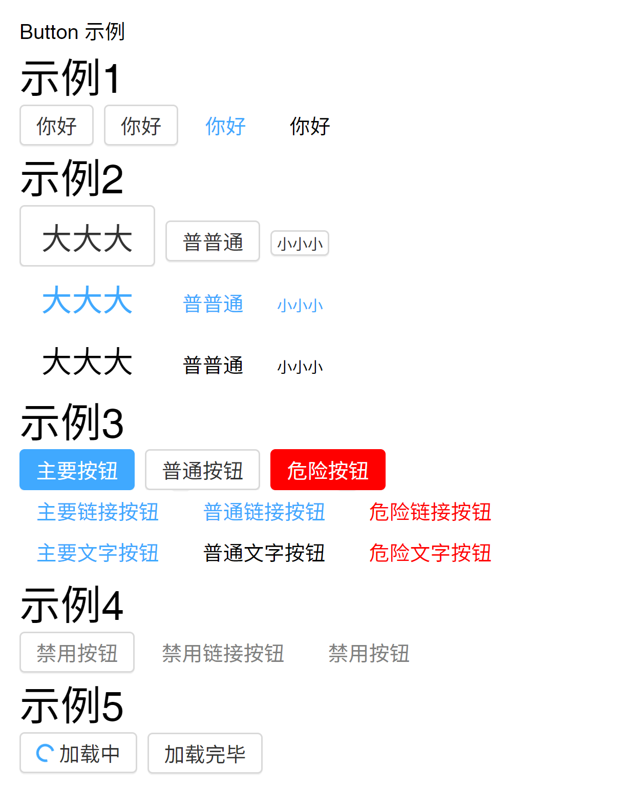
制作 Button 组件

Button

[toc]


需求分析

  • 借鉴 AntD/ Bulma/Eleme/iView/Vuetify 等
  • 需求
    • 可以有不同的等级
    • 可以是链接,可以是文字
    • 可以 click/focus/鼠标悬浮
    • 可以设置size
    • 可以设置状态为禁用
    • 可以设置状态为加载中

API 设计

1
2
3
4
5
6
7
8
<Button @click=?
        @focus=?
        @mouseover=?
        theme="button/link/text"
        level="big/normal/small"
        disabled
        loading>
</Button>

创建 Button 组件

Button 基础样式

Button.vue

 1
 2
 3
 4
 5
 6
 7
 8
 9
10
11
12
13
14
15
16
<template>
  <button>
    <slot></slot>
  </button>
</template>

<script lang="ts">
export default {
  name: 'Button'
};
</script>

<style lang="scss" scoped>

</style>

ButtonDemo.vue

 1
 2
 3
 4
 5
 6
 7
 8
 9
10
11
12
13
14
15
16
17
18
<script setup lang="ts">
import Button from '@/lib/Button.vue';
</script>

<template>
  <h1>Button 示例</h1>
  <h2>示例一</h2>
  <div>
    <Button>按钮</Button>
  </div>
</template>

<script lang="ts">
export default {
  name: 'ButtonDemo'
};
</script>

  • 使用<slot></slot>来让UI库用户自定义button内部的结构

让Button支持事件

Button.vue

 1
 2
 3
 4
 5
 6
 7
 8
 9
10
11
12
13
14
15
16
17
18
19
20
21
22
23
<script setup lang="ts">
import Button from '@/lib/Button.vue';

const onClick = () => {
  console.log('hi');
};
</script>

<template>
  <h1>Button 示例</h1>
  <h2>示例一</h2>
  <div>
    <Button @click="onClick">
      按钮
    </Button>
  </div>
</template>

<script lang="ts">
export default {
  name: 'ButtonDemo'
};
</script>
  • vue自动将绑定的事件传到子组件中根节点上
  • 不用再处理事件代理逻辑

这样会带来一个问题:点击外层元素,而未点击到button元素上也会触发事件

 1
 2
 3
 4
 5
 6
 7
 8
 9
10
11
12
13
14
15
16
17
18
19
20
21
// Button.vue
<template>
  <div>
    <button>
      <slot></slot>
    </button>
  </div>
</template>

<script lang="ts">
export default {
  name: 'Button'
};
</script>

<style lang="scss" scoped>
div {
  border: 1px solid red;
}
</style>

让div不继承属性

  • 使用inheritAttrs: false来禁用 Attribute 继承,。偶人为true
  • 此时事件没有绑在子组件任何一个元素上

Button.vue

 1
 2
 3
 4
 5
 6
 7
 8
 9
10
11
12
13
14
15
16
17
18
19
20
21
<template>
  <div>
    <button>
      <slot></slot>
    </button>
  </div>
</template>

<script lang="ts">
export default {
  name: 'Button',
  inheritAttrs: false
};
</script>

<style lang="scss" scoped>
div {
  border: 1px solid red;
}
</style>


Vue 3 属性绑定细节

让div里的button显式地绑定$attrs

  • 在父组件/元素上写$attrs,实现所有属性的祖传孙元素
  • $attrs会以对象的形式展示所有祖元素/组件上的属性
  • 使用v-bind="$attrs",此处不可缩写

Button.vue

 1
 2
 3
 4
 5
 6
 7
 8
 9
10
11
12
13
14
15
16
17
18
19
20
<template>
  <div>
    <button v-bind="$attrs">
      <slot></slot>
    </button>
  </div>
</template>

<script lang="ts">
export default {
  name: 'Button',
  inheritAttrs: false
};
</script>

<style lang="scss" scoped>
div {
  border: 1px solid red;
}
</style>
  • 小结:让组件内部某一个节点拥有外部(使用该组件时)传入的(写在标签上的)所有属性,而其他节点不同时拥有的情况

让div继承一部分属性,让button继承另一部分属性

  • setup中使用context.attrs将属性结构出来
  • script setup语法糖中,使用useAttrs()获取$attrs来处理
    • 解构赋值取出属性const {size, ...rest} = attrs;
    • 在外层div上绑定<div :size="size">...</div>
    • 在button上绑定其他剩余属性<button v-bind="rest"><slot></slot></button>

Button.vue

 1
 2
 3
 4
 5
 6
 7
 8
 9
10
11
12
13
14
15
16
17
18
19
20
21
22
23
24
25
26
27
28
29
<script setup lang="ts">
import {useAttrs} from 'vue';

const attrs = useAttrs();
const {size, ...rest} = attrs;

</script>

<template>
  <div :size="size">
    <button v-bind="rest">
      <slot></slot>
    </button>
  </div>
</template>

<script lang="ts">
export default {
  name: 'Button',
  inheritAttrs: false
};
</script>

<style lang="scss" scoped>
div {
  border: 1px solid red;
}
</style>

小结

  • Vue3属性绑定
    • 默认所有属性都绑定到根元素
    • 使用inheritAttrs: false可以取消默认绑定
    • 使用$attrs或者context.attrs获取使用该组件时绑定的所有属性
      • 单文件组件 语法糖中由const attrs = useAttrs();获取
    • 使用v-bind="$attrs"批量绑定属性
    • 使用const {size, ...rest} = context.attrs属性解构分开
      • 单文件组件 语法糖中为const {size, ...rest} = attrs;

实现让button支持theme属性

Button.vue添加属性theme的可选值为button/link/text

 1
 2
 3
 4
 5
 6
 7
 8
 9
10
11
12
13
14
15
16
17
18
19
20
21
22
23
24
25
26
<script setup lang="ts">
interface Props {
  theme?: 'button' | 'link' | 'text';
}

const props = withDefaults(defineProps<Props>(), {
  theme: 'button'
});
const {theme} = props;
</script>

<template>
  <div>
    <button class="vue-button"
            :class="`theme-${theme}`">
      <slot></slot>
    </button>
  </div>
</template>

<script lang="ts">
export default {
  name: 'Button'
};
</script>

  • button添加默认样式类vue-button
  • 动态绑定样式类 :class="`theme-${theme}`"
  • 外部数据props添加默认值const props = withDefaults(defineProps<Props>(), { theme: 'button' });

ButtonDemo.vue

 1
 2
 3
 4
 5
 6
 7
 8
 9
10
11
12
13
14
15
16
17
18
19
20
<script setup lang="ts">
import Button from '@/lib/Button.vue';

</script>

<template>
  <h1>Button 示例</h1>
  <h2>示例一</h2>
  <div>
    <Button theme="button">普通按钮</Button>
    <Button theme="link">链接按钮</Button>
    <Button theme="text">文字按钮</Button>
  </div>
</template>

<script lang="ts">
export default {
  name: 'ButtonDemo'
};
</script>

添加button组件样式

 1
 2
 3
 4
 5
 6
 7
 8
 9
10
11
12
13
14
15
16
17
18
19
20
21
22
23
24
25
26
27
28
29
30
31
32
33
34
35
@import '../var';

.vue-button {
  align-items: center;
  background: $button-background;
  border: 1px solid $border-color;
  border-radius: $radius;
  box-shadow: 0 1px 0 fade-out($shadow-color, .95);
  color: $basic-font-color;
  cursor: pointer;
  display: inline-flex;
  height: $height;
  justify-content: center;
  padding: 0 12px;
  white-space: nowrap;

  & + & {
    margin-left: 8px;
  }

  &:hover,
  &:focus {
    border-color: $light-font-color;
    color: $light-font-color;
  }

  &:focus {
    outline: none;
  }

  &::-moz-focus-inner {
    border: 0;
  }
}

UI库组件的CSS 的两个注意事项

  • 不能使用 scoped
    • 因为 data-v-xxx中的xxx每次运行可能不同
    • 必须输出稳定不变的class选择器,方便使用者覆盖
  • 必须加前缀
    • .vue-button V.S. .button
    • .vue-theme-link V.S. .theme-link

CSS最小影响原则

 1
 2
 3
 4
 5
 6
 7
 8
 9
10
11
12
13
14
15
16
17
18
19
20
21
22
23
24
25
26
27
28
src
 ┣ assets
 ┃ ┗ logo.png
 ┣ components
 ┃ ┣ ButtonDemo.vue
 ┃ ┣ DialogDemo.vue
 ┃ ┣ DocsDemo.vue
 ┃ ┣ SwitchDemo.vue
 ┃ ┣ TabsDemo.vue
 ┃ ┗ TopNav.vue
 ┣ lib
 ┃ ┣ Button.vue
 ┃ ┣ Switch.vue
 ┃ ┣ TabItem.vue
 ┃ ┣ Tabs.vue
 ┃ ┣ var.scss
 ┃ ┗ vue-reset.scss
 ┣ styles
 ┃ ┗ index.scss
 ┣ types
 ┃ ┗ tabs.d.ts
 ┣ views
 ┃ ┣ Docs.vue
 ┃ ┗ Home.vue
 ┣ App.vue
 ┣ env.d.ts
 ┣ main.ts
 ┗ router.ts

CSS不能影响库使用者

  • 使用较特殊的前缀定义样式,重构Button.vue
 1
 2
 3
 4
 5
 6
 7
 8
 9
10
11
12
13
14
15
16
17
18
19
20
21
22
23
24
25
26
27
28
29
30
31
32
33
34
35
36
37
38
39
40
41
42
43
44
45
46
47
48
49
50
51
52
53
54
55
<script setup lang="ts">
...
</script>

<template>
  <button class="vue-button"
          :class="`vue-theme-${theme}`">
    <slot></slot>
  </button>
</template>

<script lang="ts">
export default {
  name: 'Button'
};
</script>

<style lang="scss">
@import 'var';

.vue-button {
  align-items: center;
  background: $button-background;
  border: 1px solid $border-color;
  border-radius: $radius;
  box-shadow: 0 1px 0 fade-out($shadow-color, .95);
  color: $basic-font-color;
  cursor: pointer;
  display: inline-flex;
  height: $height;
  justify-content: center;
  padding: 0 12px;
  white-space: nowrap;

  & + & {
    margin-left: 8px;
  }

  &:hover,
  &:focus {
    border-color: $light-font-color;
    color: $light-font-color;
  }

  &:focus {
    outline: none;
  }

  &::-moz-focus-inner {
    border: 0;
  }
}

</style>


完成 Button 组件

让Button支持theme属性

theme的值为button/link/text 默认为button

 1
 2
 3
 4
 5
 6
 7
 8
 9
10
11
12
13
14
15
16
17
18
19
20
21
22
23
24
25
26
27
28
29
30
31
32
33
34
35
36
37
38
39
40
41
42
43
44
45
46
47
48
49
50
51
52
53
54
55
56
57
58
59
60
61
62
63
64
65
66
67
68
69
70
71
72
73
74
75
76
77
78
79
80
81
82
83
84
85
86
87
88
<script setup lang="ts">
interface Props {
  theme?: 'button' | 'link' | 'text';
}

const props = withDefaults(defineProps<Props>(), {
  theme: 'button'
});
const {theme} = props;

</script>

<template>
  <button class="vue-button"
          :class="`vue-theme-${theme}`">
    <slot></slot>
  </button>
</template>

<script lang="ts">
export default {
  name: 'Button'
};
</script>

<style lang="scss">
@import 'var';

// basic
.vue-button {
  align-items: center;
  background: $button-background;
  border: 1px solid $border-color;
  border-radius: $radius;
  box-shadow: 0 1px 0 fade-out($shadow-color, .95);
  color: $basic-font-color;
  cursor: pointer;
  display: inline-flex;
  height: $height;
  justify-content: center;
  padding: 0 12px;
  white-space: nowrap;

  & + & {
    margin-left: 8px;
  }

  &:hover,
  &:focus {
    border-color: $light-font-color;
    color: $light-font-color;
  }

  &:focus {
    outline: none;
  }

  &::-moz-focus-inner {
    border: 0;
  }

  // link
  &.vue-theme-link {
    border-color: transparent;
    box-shadow: none;
    color: $light-font-color;

    &:hover,
    &:focus {
      color: lighten($light-font-color, 10%);
    }
  }

  // text
  &.vue-theme-text {
    border-color: transparent;
    box-shadow: none;
    color: inherit;

    &:hover,
    &:focus {
      background: darken(white, 5%);;
    }
  }
}

</style>

让Button支持size属性

size的值为big/normal/small

  1
  2
  3
  4
  5
  6
  7
  8
  9
 10
 11
 12
 13
 14
 15
 16
 17
 18
 19
 20
 21
 22
 23
 24
 25
 26
 27
 28
 29
 30
 31
 32
 33
 34
 35
 36
 37
 38
 39
 40
 41
 42
 43
 44
 45
 46
 47
 48
 49
 50
 51
 52
 53
 54
 55
 56
 57
 58
 59
 60
 61
 62
 63
 64
 65
 66
 67
 68
 69
 70
 71
 72
 73
 74
 75
 76
 77
 78
 79
 80
 81
 82
 83
 84
 85
 86
 87
 88
 89
 90
 91
 92
 93
 94
 95
 96
 97
 98
 99
100
101
102
103
104
105
106
107
108
109
110
111
112
113
114
<script setup lang="ts">
import {computed} from 'vue';

interface Props {
  theme?: 'button' | 'link' | 'text';
  size?: 'normal' | 'big' | 'small';
}

const props = withDefaults(defineProps<Props>(), {
  theme: 'button',
  size: 'normal'
});
const {theme, size} = props;

// 计算classes
const classes = computed(() => {
  return {
    [`vue-theme-${theme}`]: theme,
    [`vue-size-${size}`]: size
  };
});
</script>

<template>
  <button class="vue-button"
          :class="classes">
    <slot></slot>
  </button>
</template>

<script lang="ts">
export default {
  name: 'Button'
};
</script>

<style lang="scss">
@import 'var';

// basic
.vue-button {
  align-items: center;
  background: $button-background;
  border: 1px solid $border-color;
  border-radius: $radius;
  box-shadow: 0 1px 0 fade-out($shadow-color, .95);
  color: $basic-font-color;
  cursor: pointer;
  display: inline-flex;
  height: $height;
  justify-content: center;
  padding: 0 12px;
  white-space: nowrap;

  & + & {
    margin-left: 8px;
  }

  &:hover,
  &:focus {
    border-color: $light-font-color;
    color: $light-font-color;
  }

  &:focus {
    outline: none;
  }

  &::-moz-focus-inner {
    border: 0;
  }

  // big
  &.vue-size-big {
    font-size: 24px;
    height: 48px;
    padding: 0 16px;
  }

  // small
  &.vue-size-small {
    font-size: 12px;
    height: 20px;
    padding: 0 4px;
  }

  // link
  &.vue-theme-link {
    border-color: transparent;
    box-shadow: none;
    color: $light-font-color;

    &:hover,
    &:focus {
      color: lighten($light-font-color, 10%);
    }
  }

  // text
  &.vue-theme-text {
    border-color: transparent;
    box-shadow: none;
    color: inherit;

    &:hover,
    &:focus {
      background: darken(white, 5%);;
    }
  }

}

</style>

  • 使用计算属性代替:class="vue-theme-${theme}"中的表达式,使得代码更清晰
1
2
3
4
5
6
7
8
9
...
// 计算classes
const classes = computed(() => {
  return {
    [`vue-theme-${theme}`]: theme,
    [`vue-size-${size}`]: size
  };
});
...

让button支持level属性

level的值为 main/normal/danger

  1
  2
  3
  4
  5
  6
  7
  8
  9
 10
 11
 12
 13
 14
 15
 16
 17
 18
 19
 20
 21
 22
 23
 24
 25
 26
 27
 28
 29
 30
 31
 32
 33
 34
 35
 36
 37
 38
 39
 40
 41
 42
 43
 44
 45
 46
 47
 48
 49
 50
 51
 52
 53
 54
 55
 56
 57
 58
 59
 60
 61
 62
 63
 64
 65
 66
 67
 68
 69
 70
 71
 72
 73
 74
 75
 76
 77
 78
 79
 80
 81
 82
 83
 84
 85
 86
 87
 88
 89
 90
 91
 92
 93
 94
 95
 96
 97
 98
 99
100
101
102
103
104
105
106
107
108
109
110
111
112
113
114
115
116
117
118
119
120
121
122
123
124
125
126
127
128
129
130
131
132
133
134
135
136
137
138
139
140
141
142
143
144
145
146
147
148
149
150
151
152
153
154
155
156
157
158
159
160
161
162
163
164
165
166
167
168
169
170
171
172
173
174
175
176
177
178
179
180
<script setup lang="ts">
import {computed} from 'vue';

interface Props {
  theme?: 'button' | 'link' | 'text';
  size?: 'normal' | 'big' | 'small';
  level?: 'normal' | 'primary' | 'danger';
}

const props = withDefaults(defineProps<Props>(), {
  theme: 'button',
  size: 'normal',
  level: 'normal'
});
const {theme, size, level} = props;

// 计算classes
const classes = computed(() => {
  return {
    [`vue-theme-${theme}`]: theme,
    [`vue-size-${size}`]: size,
    [`vue-level-${level}`]: level,
  };
});
</script>

<template>
  <button class="vue-button"
          :class="classes">
    <slot></slot>
  </button>
</template>

<script lang="ts">
export default {
  name: 'Button'
};
</script>

<style lang="scss">
@import 'var';

// basic
.vue-button {
  align-items: center;
  background: $button-background;
  transition: background 250ms;
  border: 1px solid $border-color;
  border-radius: $radius;
  box-shadow: 0 1px 0 fade-out($shadow-color, .95);
  color: $basic-font-color;
  cursor: pointer;
  display: inline-flex;
  height: $height;
  justify-content: center;
  padding: 0 12px;
  white-space: nowrap;

  & + & {
    margin-left: 8px;
  }

  &:hover,
  &:focus {
    border-color: $light-font-color;
    color: $light-font-color;
  }

  &:focus {
    outline: none;
  }

  &::-moz-focus-inner {
    border: 0;
  }

  // big
  &.vue-size-big {
    font-size: 24px;
    height: 48px;
    padding: 0 16px;
  }

  // small
  &.vue-size-small {
    font-size: 12px;
    height: 20px;
    padding: 0 4px;
  }

  // link
  &.vue-theme-link {
    border-color: transparent;
    box-shadow: none;
    color: $light-font-color;

    &:hover,
    &:focus {
      color: lighten($light-font-color, 10%);
    }
  }

  // text
  &.vue-theme-text {
    border-color: transparent;
    box-shadow: none;
    color: inherit;

    &:hover,
    &:focus {
      background: darken(white, 5%);;
    }
  }

  // level
  &.vue-theme-button {
    // primary
    &.vue-level-primary {
      background: $light-font-color;
      color: white;
      border-color: $light-font-color;

      &:hover,
      &:focus {
        background: darken($light-font-color, 10%);
        border-color: darken($light-font-color, 10%);
      }
    }

    // danger
    &.vue-level-danger {
      background: $danger;
      border-color: $danger;
      color: white;

      &:hover,
      &:focus {
        background: darken($danger, 10%);
        border-color: darken($danger, 10%);
      }
    }
  }

  &.vue-theme-link {
    // danger
    &.vue-level-danger {
      color: $danger;

      &:hover,
      &:focus {
        color: darken($danger, 10%);
      }
    }
  }

  &.vue-theme-text {
    // primary
    &.vue-level-primary {
      color: $light-font-color;

      &:hover,
      &:focus {
        color: darken($light-font-color, 10%);
      }
    }

    // danger
    &.vue-level-danger {
      color: $danger;

      &:hover,
      &:focus {
        color: darken($danger, 10%);
      }
    }
  }
}

</style>


让button支持disabled属性

disabled的值为 true/false 默认为false

  • <button disabled>
  • <button :disabled="true">
  • <button disabled="true"> 错误
  • <button disabled="false"> 错误
  1
  2
  3
  4
  5
  6
  7
  8
  9
 10
 11
 12
 13
 14
 15
 16
 17
 18
 19
 20
 21
 22
 23
 24
 25
 26
 27
 28
 29
 30
 31
 32
 33
 34
 35
 36
 37
 38
 39
 40
 41
 42
 43
 44
 45
 46
 47
 48
 49
 50
 51
 52
 53
 54
 55
 56
 57
 58
 59
 60
 61
 62
 63
 64
 65
 66
 67
 68
 69
 70
 71
 72
 73
 74
 75
 76
 77
 78
 79
 80
 81
 82
 83
 84
 85
 86
 87
 88
 89
 90
 91
 92
 93
 94
 95
 96
 97
 98
 99
100
101
102
103
104
105
106
107
108
109
110
111
112
113
114
115
116
117
118
119
120
121
122
123
124
125
126
127
128
129
130
131
132
133
134
135
136
137
138
139
140
141
142
143
144
145
146
147
148
149
150
151
152
153
154
155
156
157
158
159
160
161
162
163
164
165
166
167
168
169
170
171
172
173
174
175
176
177
178
179
180
181
182
183
184
185
186
187
188
189
190
191
192
193
194
195
196
197
198
199
<script setup lang="ts">
import {computed} from 'vue';

interface Props {
  theme?: 'button' | 'link' | 'text';
  size?: 'normal' | 'big' | 'small';
  level?: 'normal' | 'primary' | 'danger';
  disabled?: Boolean;
}

const props = withDefaults(defineProps<Props>(), {
  theme: 'button',
  size: 'normal',
  level: 'normal',
  disabled: false
});
const {theme, size, level, disabled} = props;

// 计算classes
const classes = computed(() => {
  return {
    [`vue-theme-${theme}`]: theme,
    [`vue-size-${size}`]: size,
    [`vue-level-${level}`]: level,
  };
});
</script>

<template>
  <button class="vue-button"
          :class="classes"
          :disabled="disabled">
    <slot></slot>
  </button>
</template>

<script lang="ts">
export default {
  name: 'Button'
};
</script>

<style lang="scss">
@import 'var';

// basic
.vue-button {
  align-items: center;
  background: $button-background;
  transition: background 250ms;
  border: 1px solid $border-color;
  border-radius: $radius;
  box-shadow: 0 1px 0 fade-out($shadow-color, .95);
  color: $basic-font-color;
  cursor: pointer;
  display: inline-flex;
  height: $height;
  justify-content: center;
  padding: 0 12px;
  white-space: nowrap;

  & + & {
    margin-left: 8px;
  }

  &:hover,
  &:focus {
    border-color: $light-font-color;
    color: $light-font-color;
  }

  &:focus {
    outline: none;
  }

  &::-moz-focus-inner {
    border: 0;
  }

  // big
  &.vue-size-big {
    font-size: 24px;
    height: 48px;
    padding: 0 16px;
  }

  // small
  &.vue-size-small {
    font-size: 12px;
    height: 20px;
    padding: 0 4px;
  }

  // link
  &.vue-theme-link {
    border-color: transparent;
    box-shadow: none;
    color: $light-font-color;

    &:hover,
    &:focus {
      color: lighten($light-font-color, 10%);
    }
  }

  // text
  &.vue-theme-text {
    border-color: transparent;
    box-shadow: none;
    color: inherit;

    &:hover,
    &:focus {
      background: darken(white, 5%);;
    }
  }

  // level
  &.vue-theme-button {
    // primary
    &.vue-level-primary {
      background: $light-font-color;
      color: white;
      border-color: $light-font-color;

      &:hover,
      &:focus {
        background: darken($light-font-color, 10%);
        border-color: darken($light-font-color, 10%);
      }
    }

    // danger
    &.vue-level-danger {
      background: $danger;
      border-color: $danger;
      color: white;

      &:hover,
      &:focus {
        background: darken($danger, 10%);
        border-color: darken($danger, 10%);
      }
    }
  }

  &.vue-theme-link {
    // danger
    &.vue-level-danger {
      color: $danger;

      &:hover,
      &:focus {
        color: darken($danger, 10%);
      }
    }
  }

  &.vue-theme-text {
    // primary
    &.vue-level-primary {
      color: $light-font-color;

      &:hover,
      &:focus {
        color: darken($light-font-color, 10%);
      }
    }

    // danger
    &.vue-level-danger {
      color: $danger;

      &:hover,
      &:focus {
        color: darken($danger, 10%);
      }
    }
  }

  // disabled
  &.vue-theme-button {
    &[disabled]:hover {
      border-color: $grey;
    }
  }

  &.vue-theme-button,
  &.vue-theme-link,
  &.vue-theme-text {
    &[disabled] {
      cursor: not-allowed;
      color: $grey;
    }
  }
}

</style>

  • 如果已经声明外部属性props中的disabled,就不会被继承
  • 需要手动写明<button :disabled="disabled">绑定属性

让button支持loading属性

loading的值为 true/false

  1
  2
  3
  4
  5
  6
  7
  8
  9
 10
 11
 12
 13
 14
 15
 16
 17
 18
 19
 20
 21
 22
 23
 24
 25
 26
 27
 28
 29
 30
 31
 32
 33
 34
 35
 36
 37
 38
 39
 40
 41
 42
 43
 44
 45
 46
 47
 48
 49
 50
 51
 52
 53
 54
 55
 56
 57
 58
 59
 60
 61
 62
 63
 64
 65
 66
 67
 68
 69
 70
 71
 72
 73
 74
 75
 76
 77
 78
 79
 80
 81
 82
 83
 84
 85
 86
 87
 88
 89
 90
 91
 92
 93
 94
 95
 96
 97
 98
 99
100
101
102
103
104
105
106
107
108
109
110
111
112
113
114
115
116
117
118
119
120
121
122
123
124
125
126
127
128
129
130
131
132
133
134
135
136
137
138
139
140
141
142
143
144
145
146
147
148
149
150
151
152
153
154
155
156
157
158
159
160
161
162
163
164
165
166
167
168
169
170
171
172
173
174
175
176
177
178
179
180
181
182
183
184
185
186
187
188
189
190
191
192
193
194
195
196
197
198
199
200
201
202
203
204
205
206
207
208
209
210
211
212
213
214
215
216
217
218
219
220
221
222
223
224
225
226
<script setup lang="ts">
import {computed} from 'vue';

interface Props {
  theme?: 'button' | 'link' | 'text';
  size?: 'normal' | 'big' | 'small';
  level?: 'normal' | 'primary' | 'danger';
  disabled?: Boolean;
  loading?: Boolean;
}

const props = withDefaults(defineProps<Props>(), {
  theme: 'button',
  size: 'normal',
  level: 'normal',
  disabled: false,
  loading: false,
});
const {theme, size, level, disabled, loading} = props;

// 计算classes
const classes = computed(() => {
  return {
    [`vue-theme-${theme}`]: theme,
    [`vue-size-${size}`]: size,
    [`vue-level-${level}`]: level,
  };
});
</script>

<template>
  <button class="vue-button"
          :class="classes"
          :disabled="disabled">
    <span class="vue-loadingIndicator"
          v-if="loading"></span>
    <slot></slot>
  </button>
</template>

<script lang="ts">
export default {
  name: 'Button'
};
</script>

<style lang="scss">
@import 'var';

// basic
.vue-button {
  align-items: center;
  background: $button-background;
  transition: background 250ms;
  border: 1px solid $border-color;
  border-radius: $radius;
  box-shadow: 0 1px 0 fade-out($shadow-color, .95);
  color: $basic-font-color;
  cursor: pointer;
  display: inline-flex;
  height: $height;
  justify-content: center;
  padding: 0 12px;
  white-space: nowrap;

  & + & {
    margin-left: 8px;
  }

  &:hover,
  &:focus {
    border-color: $light-font-color;
    color: $light-font-color;
  }

  &:focus {
    outline: none;
  }

  &::-moz-focus-inner {
    border: 0;
  }

  // big
  &.vue-size-big {
    font-size: 24px;
    height: 48px;
    padding: 0 16px;
  }

  // small
  &.vue-size-small {
    font-size: 12px;
    height: 20px;
    padding: 0 4px;
  }

  // link
  &.vue-theme-link {
    border-color: transparent;
    box-shadow: none;
    color: $light-font-color;

    &:hover,
    &:focus {
      color: lighten($light-font-color, 10%);
    }
  }

  // text
  &.vue-theme-text {
    border-color: transparent;
    box-shadow: none;
    color: inherit;

    &:hover,
    &:focus {
      background: darken(white, 5%);;
    }
  }

  // level
  &.vue-theme-button {
    // primary
    &.vue-level-primary {
      background: $light-font-color;
      color: white;
      border-color: $light-font-color;

      &:hover,
      &:focus {
        background: darken($light-font-color, 10%);
        border-color: darken($light-font-color, 10%);
      }
    }

    // danger
    &.vue-level-danger {
      background: $danger;
      border-color: $danger;
      color: white;

      &:hover,
      &:focus {
        background: darken($danger, 10%);
        border-color: darken($danger, 10%);
      }
    }
  }

  &.vue-theme-link {
    // danger
    &.vue-level-danger {
      color: $danger;

      &:hover,
      &:focus {
        color: darken($danger, 10%);
      }
    }
  }

  &.vue-theme-text {
    // primary
    &.vue-level-primary {
      color: $light-font-color;

      &:hover,
      &:focus {
        color: darken($light-font-color, 10%);
      }
    }

    // danger
    &.vue-level-danger {
      color: $danger;

      &:hover,
      &:focus {
        color: darken($danger, 10%);
      }
    }
  }

  // disabled
  &.vue-theme-button {
    &[disabled]:hover {
      border-color: $grey;
    }
  }

  &.vue-theme-button,
  &.vue-theme-link,
  &.vue-theme-text {
    &[disabled] {
      cursor: not-allowed;
      color: $grey;
    }
  }

  // loading
  > .vue-loadingIndicator {
    width: 14px;
    height: 14px;
    display: inline-block;
    margin-right: 4px;
    border-radius: 7px;
    border-color: $light-font-color $light-font-color $light-font-color transparent;
    border-style: solid;
    border-width: 2px;
    animation: vue-spin 1s infinite linear;
  }

}

@keyframes vue-spin {
  0% {
    transform: rotate(0deg)
  }
  100% {
    transform: rotate(360deg)
  }
}

</style>


知识点小结

  • Vue属性继承
    • 默认属性传给根元素
    • inheritAttrs: false禁用默认继承
    • v-bind="$attrs"context.attrs
  • props V.S. attrs
    • props需要显式地声明属性
    • 未显示声明的属性都在attrs
  • 库的CSS要求
    • 不可用scoped
    • 每个 CSS 类要加前缀
    • CSS最小影响原则

UI参考