3.1 简单轮子 VueGrid:网格系统 ⇧
大纲链接 §
[toc]
大纲
- 什么是
Grid System网格系统 - 组件UI
- 组件代码
- 单元测试
什么是 网格系统/栅格系统 Grid System ⇧
- 知乎问答:什么是栅格化设计
- 就是把一个 div 分成 N 个部分(N = 12, 16, 24…),每个部分无空隙或者有空隙
一些名词概念 ⇧
栅格:grid布局:layout空隙:gutter偏移:offset跨度:span分别有12 x 28 x 36 x 44 x 63 x 82 x 12
组件UI结构 ⇧
|
|
flex布局- 横向布局
- 纵向布局
- 有无空隙
gutter - 自适应 or 响应式
- 只要是
flex布局都可以是自适应的 - 响应式专指利用媒体查询
@media做各种客户端的适配
- 只要是
API设计 ⇧
父组件
<vue-row></vue-row>
- 参数:
alignguttercolData
子组件
<vue-col></vue-col>
- 参数:
spanoffsetmobilepadlaptoppcpcwpcx
组件UI设计 ⇧
设计图
语雀设计稿
- 链接
- 采用 24 栅格系统
参考
gulu UI
组件代码 ⇧
实现基本样式 ⇧
列组件
row.vue
|
|
- 独占一整行
- 设置插槽
<slot></slot>,存放 一个或多个 行组件
行组件
col.vue
|
|
- 设置插槽
<slot></slot>,存放 其他元素 - 行内弹性盒
展示组件
GridSystems.vue
|
|
实现等分栅栏 ⇧
GridSystems.vue
|
|
实现不等分栅栏 ⇧
GridSystems.vue
- 一种做法是尝试使用自定义属性
data-span定义跨度值,通过属性选择器定义样式
|
|
- 需要定义
.col.col-1 ~ .col.col-24每一个样式- 太麻烦
- 重复
推荐使用 外部数据 + scss 循环语法 代替自定义属性 实现不等分栅栏
./src/components/GridSystems.vue
|
|
- 设置外部属性
span
./src/components/grid-system/VueCol.vue
|
|
- 外部数据的类型可以给多个类型
@Prop({type: [String, Number],}) span!: string - 绑定样式
:class="[`col-${ span }`]" scss- 循环语法
@for - 插值语法
#{xxx} - 定义变量
$xxx: yyy
- 循环语法
为什么定义了
width: 50%;,在父容器display: flex;中的三个元素仍可以平均分配整个宽度
- 定义了
display: flex;的元素 默认属性flex-wrap: nowrap;,会使子元素 默认不换行 - 而且不换行的子元素的
flex-grow默认为1,自动平均撑满父元素 - 设置
flex-wrap: wrap;,或者设置flex-shrink: 0;不收缩,超出宽度的子元素会被挤到下一行
实现栅栏偏移 ⇧
精确地定义偏移量
offset
GridSystems.vue传值offsetVueCol.vue设置外部数据offset
GridSystems.vue
|
|
VueCol.vue
|
|
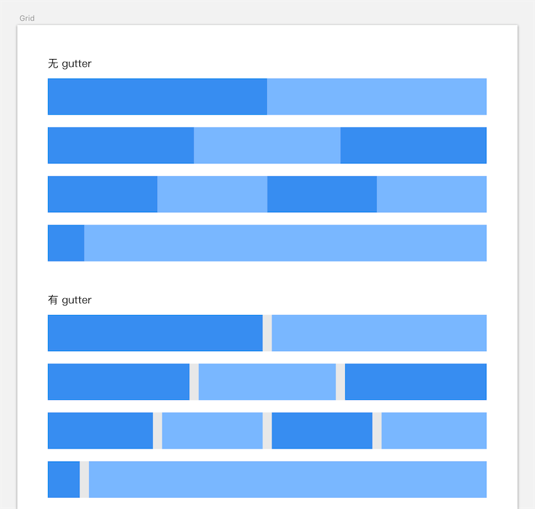
实现固定空隙 gutter ⇧
- 设定空隙为
10px - 所有元素
box-sizing: border-box; - 子元素使用
margin: 0 10px; - 父元素使用 负
margin: 0 -20px;消除左右内部两边多余的margin - 左右和整个父元素宽度(页面宽度)对齐
GridSystems.vue
|
|
VueRow.vue
|
|
VueCol.vue
|
|
实现 可设置 的固定空隙 gutter ⇧
margin值改为可设置的属性,VueRow.vue传外部数据gutter
- 绑定
style属性::style="{marginLeft: -gutter + 'px', marginRight: -gutter + 'px'}"
|
|
VueCol.vue
|
|
GridSystems.vue
|
|
用Vue钩子实现 添加空隙 ⇧
重复写属性
gutter,能否只写一次,父组件拿到数据传给子组件
created时拿到子组件``- 将
gutter属性传入
在
VueRow.vue中控制台打印出子组件
created() {console.log(this.$children);}- 控制台得到空
- 点开数组,有属性
- chrome bug
const a = []; console.log(a); a.push(1);点开数组,有属性 created时,还没有子组件
created和mounted的区别
mounted() {console.log(this.$children);}控制台得到包含子组件的数组- 类比
created好比const div = document.createElement('div')在内存中创建对象mounted好比document.body.appendChild(div)将对象挂载到页面中去
Vue.js处理 父子组件挂载顺序,可在控制台打印:- 在
VueRow.vue中写:created() {console.log(row created);}mounted() {console.log(row mounted);}
- 在
VueCol.vue中写:created() {console.log(col created);}mounted() {console.log(col mounted);}
- 在
- 先创建父组件,再创建子组件,将子组件挂载到父组件上,将父组件挂载到根组件上
- 当父组件已经挂载到页面上,即
mounted()时,说明父组件可取到所有子组件 - 为每个获取到的子组件添加属性
- 必须判断子组件类型是否为
VueRow
VueRow.vue
|
|
- 在
VueRow上接受一个外部数据gutter VueRow将gutter传入每一个子组件VueCol- 注意类型声明
(vm as any).gutter = this.gutter; - 代替写法
const source = {'gutter': this.gutter};Object.assign(vm, source);
- 在子组件里需要声明
data数据gutter - 或者使用
this.$set(vm, 'gutter', gutter);/Vue.set(vm,'gutter', gutter); - 或者使用
Provide Inject的装饰器写法@Provide('gutterToSon') gutterToSon = this.gutter;来传递gutter属性
|
|
- 在组件挂载时,调用
this.gutterToCol()向子组件传递gutter属性
重构VueRow和VueCol组件 ⇧
- 将组件标签内的js代码
:class="{...}"提取到计算属性中computed: {getClass() {...}} - 不提取到
data中时因为data只会在一开始读取引用的数据 - 当引用的数据变了,不会相应改变
- 当一个属性时依赖(引用)另一个属性时,必须使用
computed
VueCol.vue
|
|
const {span, offset} = this;解构赋值变量style内联样式优先级高于classspan默认不为0,@for $n from 1 through 24,n从1开始offset默认为0,所以@for $i from 0 through 24,i从0开始
VueRow.vue
|
|
需要重构的代码
- 重复两次及以上:重复代码就是潜在的 bug,存在遗漏更新的风险
- 一眼看不懂
如何重构
- 提取变量
- 模块化
添加对齐align属性 ⇧
VueRow.vue
|
|
- 无对齐
'', 左对齐'left', 右对齐'right', 居中对齐'center' - 对齐字符映射
$align-types: ('left': flex-start, ...); scss循环语法@each $name, $type in $align-types {...}
GridSystems.vue
|
|
实现响应式@media ⇧
根据屏幕不同的宽度预设子项不同比列,页面变化时,比列改变
|
|
- 通过传的外部数据,将不同类型响应式的属性体现在html标签上
- 外部数据类型为对象,将多个属性值写入,覆盖默认值
VueCol.vue
|
|
- 验证属性
'span', 'offset'是否存在于moblie中 - 改用数组实现
- 一个数组必须包含在里一个数组里
[1, 2]∈[1, 2, 3]
- 取得对象的属性列表
keys:Object.keys(xxx)- 判断子集
['span', 'offset'] ['span', 'offset'].includes(key)
- 判断子集
- 抽出
src/libs/objKeyValidator.ts函数
实现验证属性的方法
@/utils/objKeyValidator.ts
|
|
VueCol.vue
|
|
CSS不能读取JS变量
- 需要将
JS的变化体现在组件的:class中 - 用
:class的变化改变样式 - 使用不同的
CSS类切换 - 在
@media中设置对应不同的样式 - 在不同的客户端中,写在后面的
@media起效时覆盖写在前面的样式,优先级更高
|
|
VueCol.vue实现moblie适配
|
|
VueRow.vue
|
|
- 当处于
mobile屏幕尺寸时,设置flex-wrap: wrap;可以换行
各屏幕尺寸参考 ⇧
xs< 576px- 这样的命名不够直接表示屏幕的种类,所以改为
mobile-< 576pxpad-577 ~ 768pxlaptop-769 ~ 992pxpc-993 ~ 1200pxpcwPC wide -1201 ~ 1600pxpcxPC extreamly wide -> 1601px
VueCol.vue实现客户端适配
|
|
重构 VueCol.vue ⇧
VueCol.vue
|
|
- 需要判断 默认样式
- 检查没有传外部数据的情况
...[],不能为undefined...(mobile && [`col-mobile-${mobile.span}`, `offset-mobile-${(mobile.offset)}`] )- 改为
...(mobile ? [`col-mobile-${mobile.span}`, `offset-mobile-${(mobile.offset)}`] : [] )
GridSystems.vue
|
|
重构重复样式 ⇧
- SCSS 语法
- 使用模块
@use "sass:math";写在文件的开头,或紧接其他模块(math.div(24px, 24))// 1px
@use "sass:list";写在文件的开头,或紧接其他模块- 取值
list.nth(577px 768px, 1)// 577px
- 取值
@each遍历@for循环
- 使用模块
VueCol.vue
|
|
- 双重循环
media loops,外层@each $type, $size in $media-types {...},内层@for $n from 1 through 24 {...} - 数据结构
$media-types: ($type, $size)
|
|
选择一种作为默认屏幕 ⇧
由需求决定默认的屏幕尺寸
- 将
mobile作为默认样式,移除所有mobile相关代码 - 设置各类屏幕匹配参数
{span, offset, mobile, pad, laptop, pc, pcw, pcx}- 去除外部数据默认值
default: () => ({span: 12, offset: 0}), - 匹配屏幕时启用对应的样式
...(pcx ? [`col-pcx-${pcx.span}`, `offset-pcx-${(pcx.offset)}`] : []),否则为空
- 去除外部数据默认值
更智能的响应式 ⇧
如果使用组件库的开发者未在
VueCol上添加媒体查询的属性如:pad="{xxx}",如何兼容样式
- 原先的媒体查询是既有
min-width又有max-width,限定死了范围 - 只有特定档位的宽度才能匹配对应样式
- 当不写对应的属性时,就没有样式
尺寸 向小兼容 依次增大宽度
- 只写最小宽度
@media (min-width: ***px) {xxx}注意代码顺序与样式覆盖@media (min-width: 370px) {...}对应mobile样式@media (min-width: 577px) {...}对应pad样式@media (min-width: 769px) {...}对应laptop样式@media (min-width: 993px) {...}对应pc样式@media (min-width: 1201px) {...}对应pcw样式@media (min-width: 1601px) {...}对应pcx样式
- 例如
width: 666px;最先匹配mobile,然后向下匹配pad,直到没有再能匹配的宽度最终应用到pad样式- 假设没传
:pad="{xxx}"属性,width: 666px;找到@media (min-width: 370px) {...},会自动匹配mobile的样式
VueCol.vue
|
|
- 实现
Mobile First响应式 移动端优先
根据内部VueRow的子组件数量 即兄弟元素的数量来设置样式 ⇧
gutterToCol(){}将gutter属性值传递给子组件const {$children, gutter} = this;$children.forEach((vm: Vue) => {}
VueRow.vue
|
|
VueGrid 组件实时监听窗口尺寸变化 ⇧
Vue.js在监听window上的 事件 时,往往会显得 力不从心
window.resize比如canvas自适应。 根据窗口的变化去变化canvas的宽度
1.定义 一个记录宽度属性 并赋默认值 ⇧
screenWidth: document.body.clientWidth不包括滚动条
2.方法 更新(重新赋值)this.screenWidth ⇧
|
|
3.挂载并在销毁前移除方法 ⇧
reisze事件在created或者mounted的时候 去监听事件,并设置监听回调在
beforeDestroy的时候,移除监听回调
|
|
- 注意注册监听不可用箭头函数,否则移除回调时无法引用
- 添加事件监听、移除事件监听的格式必须一致,否则会移除失效
This will:
- register your Vue method on component creation
- trigger myEventHandler when the browser window is resized
- free up memory once your component is destroyed.
参考
高内聚化
- 通过
hook监听组件销毁钩子函数,并取消监听事件,代替 写beforeDestroy钩子
|
|
- 在Vue组件中,可以用过
$on或$once去监听所有的生命周期钩子函数 - 如监听组件的
updated钩子函数可以写成this.$on('hook:updated', () => {})
参考
4.方法改为 发布自定义事件 传递参数至父组件 ⇧
|
|
5.做一下防抖处理 ⇧
自己写的
|
|
提取为
debounce函数
- 如果使用了
debounce防抖 - 不要将
debounce放到addEventListener的方法里,直接放在处理函数里
例如:
window.addEventListener('resize', debounce(this.pageResize,200))移除失效- 需要将
debounce()放在this.pageResize方法里面
./src/utils/debounce.ts
|
|
VueCol.vue
|
|
使用
lodash
- 安装
yarn add lodash - 安装类型
yarn add -D @types/lodash - 引用
import _ from 'lodash';
|
|
6.其他 ⇧
- 不可直接在组件上监听事件
@resize,内部无法处理window和document上的事件
7.使用 Vue.js 的第三方库监听resize事件 ⇧
1.使用库
vue-resize添加监听组件<resize-observer @notify="handleResize" />
|
|
2.或者使用第三方封装的指令
David-Desmaisons/Vue.resize
|
|
Vue directive to detect HTML resize events based on CSS Element Queries with debouncing and throttling capacity.
3.或者使用
vue-window-size取得width,height属性
参考
单元测试 ⇧
异步测试 ⇧
时机
|
|
VueRow中的gutter
- 使用了钩子传递参数时,必须使用异步测试
业界知名UI
Bootstrap v5 Grid systemElement UI vue2 Layout 布局Element UI vue3 LayoutAnt Design v4 Grid栅格Bulma: the modern CSS framework that just works
参考 ⇧
相关文章 ⇧
- 无
- 作者: Joel
- 文章链接:
- 版权声明
- 非自由转载-非商用-非衍生-保持署名
- 河 掘 思 知 简